
Add Filter icon
Add Filter Icon then Set Boolean Variable true using OnSelect =Set(Show_Filter_Container, true). This will make the Container with Filter Values appear on the screen.
Add Container and align to Filter Icon
adjust container colors to match branding of PowerApp
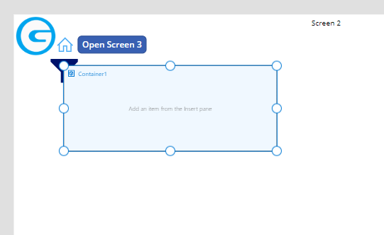
Set Container Property Visible to Boolean variable (Show_Filter_Container)
Copy and paste Filter icon inside of container and adjust colors to match branding of PowerApp (*Existing icon can be copied and pasted to use previously set colors).
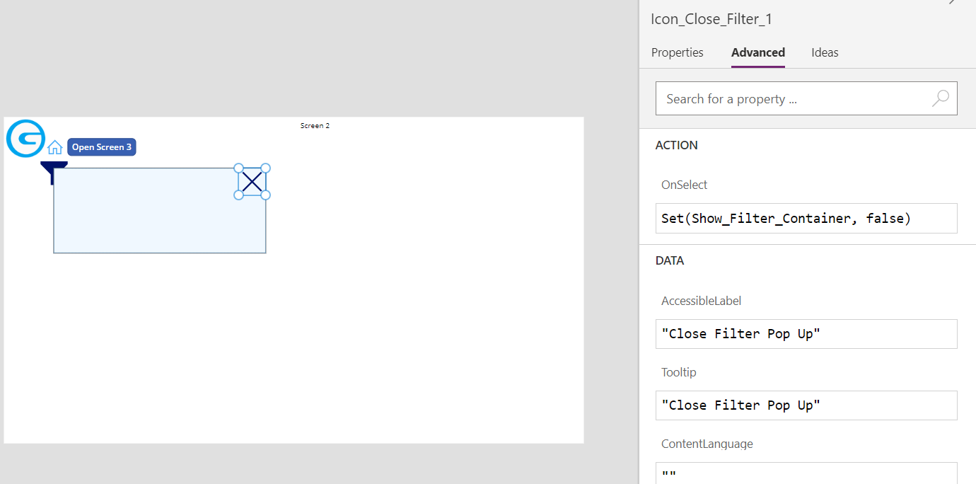
Change AccesibleLabel and Tooltip = “Close Filter Pop Up” and OnSelect = Set(Boolean_Variable, false) to hide container
This will enable filter to pop to become visible or be hidden
Add Gallery to display Filter_Type
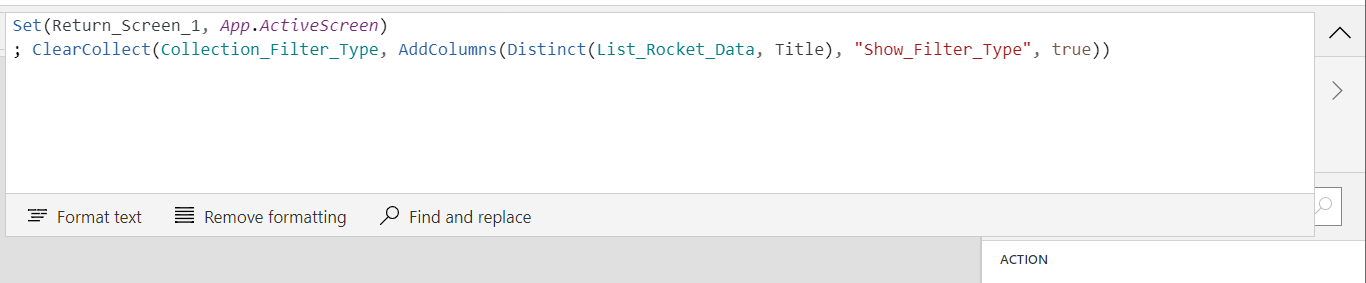
Create a collection for selecting Filter_Type and Add “Show_Filter_Type” column default value to true
; ClearCollect(Collection_Filter_Type, AddColumns(Distinct(List_Rocket_Data, Title), “Show_Filter_Type”, true))
Insert a blank vertical gallery then add a checkbox
Set checkbox size to match layout: font, size, colors
Set Template Size to fit data and Padding = 0
Add Label on gallery using checkbox
lineup checkbox and gallery, resize to fit container
Set checkbox to false default, Text Filter_Type
Set OnCheck:
Clear(Collection_Filter_Type)
Collect(Collection_Filter_Type, Distinct(Filter_Type),
AddColumns(“Show_Filter_Type”, true)
Clear(Collection_SubFilter_Type)
Collect(Collection_SubFilter_Type, Collection_App_SubFilter)
AddColumns(Show_SubFilter, true)
To Clear Selection erase data then recreate
Set OnUnCheck:
Clear(Collection_Filter_Type)
Collect(Collection_Filter_Type, Distinct(Filter_Type),
AddColumns(“Show_Filter_Type”, true)
Clear(Collection_SubFilter_Type)
Collect(Collection_SubFilter_Type, Collection_App_SubFilter)
AddColumns(Show_SubFilter, true)
Add Checkbox for SubFilter, default false, Text = SubFilter
Set OnCheck:
Clear(Collection_SubFilter)
Collect(Collection_SubFilter, Collection_App_SubFilter) AddColumn(“Show_SubFilter”, true)
Set OnUncheck:
Clear(Collection_SubFilter)
Collect(Collection_SubFilter, Collection_App_SubFilter) AddColumn(“Show_SubFilter”, false)
Add Gallery to display SubFilter_Type
Add Gallery for SubFilter. Set Items to Collection_SubFilter_Type sorted by Filter_Type, Filter_Number
Add checkbox set default to Show_SubFilter, Text = SubFilter, Tooltip = “Select Sub Filter To Show”
Set OnCheck:
Patch(Collection_SubFilter, ThisItem, {Show_SubFilter: true})
Set OnUnCheck:
Patch(Collection_SubFilter, ThisItem, {Show_SubFilter: false})
Add Date Selection to establish date filter
Add Date Picker, set default date = DataAdd(Today(), 365, TimeUnit.Days), Start Year = 2000, End = 2050
Add Button Rename Filter, Text=Filter
Set OnSelect:
Clear(Collection_Filtered_Details)
ForAll(Filter(Collection_SubFilter, Show_SubFilter)
Collect(Collection_Filtered_Details
, ClearCollect(Filtered_Sorted, Filtered)
Filter(Collection_App_Details, Filter_Type = Collection_App_Details[@Filter_Type], DatePicker1.SelectedDate < Collection_App_Details[@Start_Date]
} ) )